The Mask of Merryvale Manor
“We’re actually all rather terrible.”
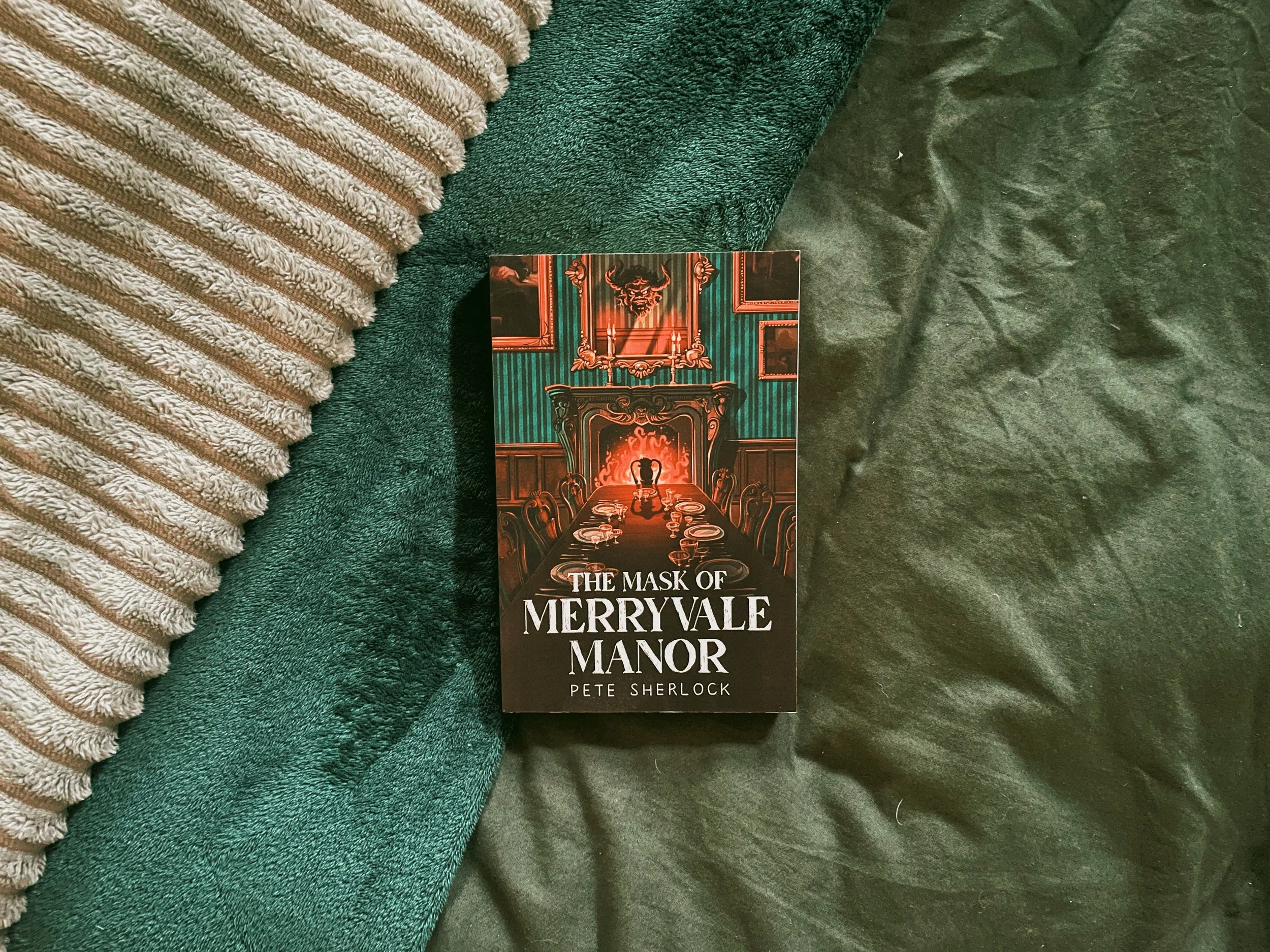
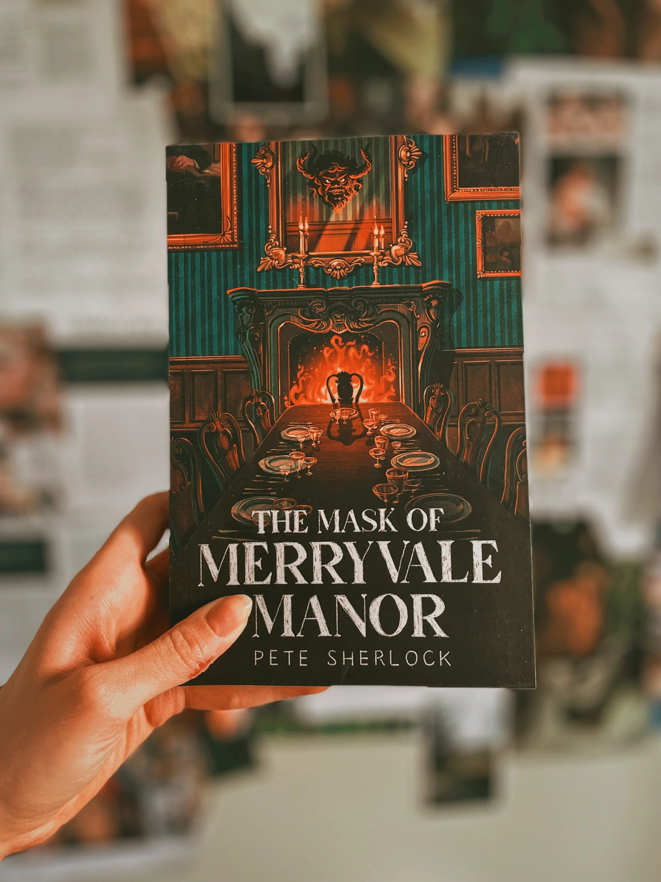
In 2024 I was approached by Fairlight Books to create a full jacket for their upcoming paperback – ‘The Mask of Merryvale Manor’ by Pete Sherlock – that was released on June 20th, 2024. I am a fan of murder mystery novels, so this was a delightful opportunity.
the brief
I was asked by the publisher to work on different sketches that would:
Include view of an empty dining room and the mansion exterior;
Avoid the colour blue and preferably stick to jewel tones;
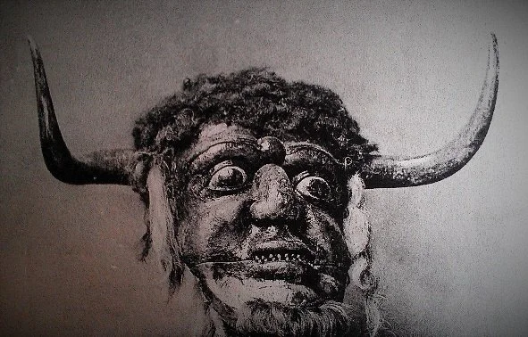
Ideally depict the mask on the front cover.
It was important to me to read the full novel first so I could incorporate hints from the story into the cover design.
the sketches
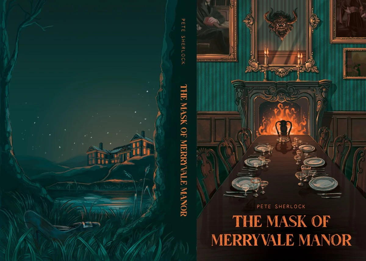
After reading the gripping manuscript, I created 5 different sketches for the jacket, making sure I included subtle symbolism and references to the text throughout the artwork – like the mask over the fireplace, a high-heeled shoe buried in the mud, long, eerie shadows, the warm, yet somewhat threatening glow of a fireplace, centuries-old family portraits and references to wealth and mystery. I wanted to create a gloomy, dark and intriguing atmosphere, so I settled on the opposing jewel tones of teal and blazing, fiery orange.

1: Merryvale exterior through the gate
2: The dining room

3: The arrival
4: The arrival in red

5: The shadow
the process
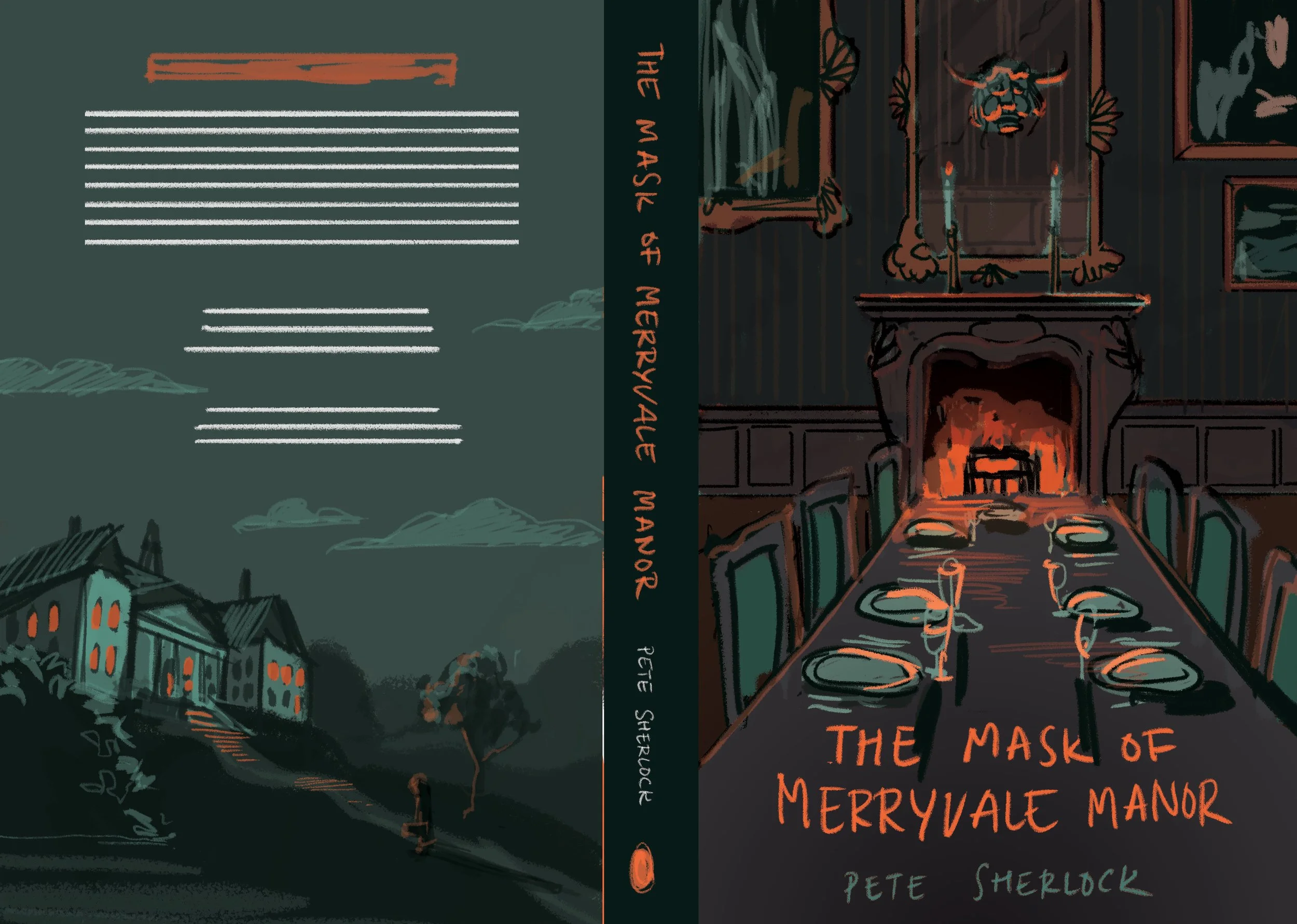
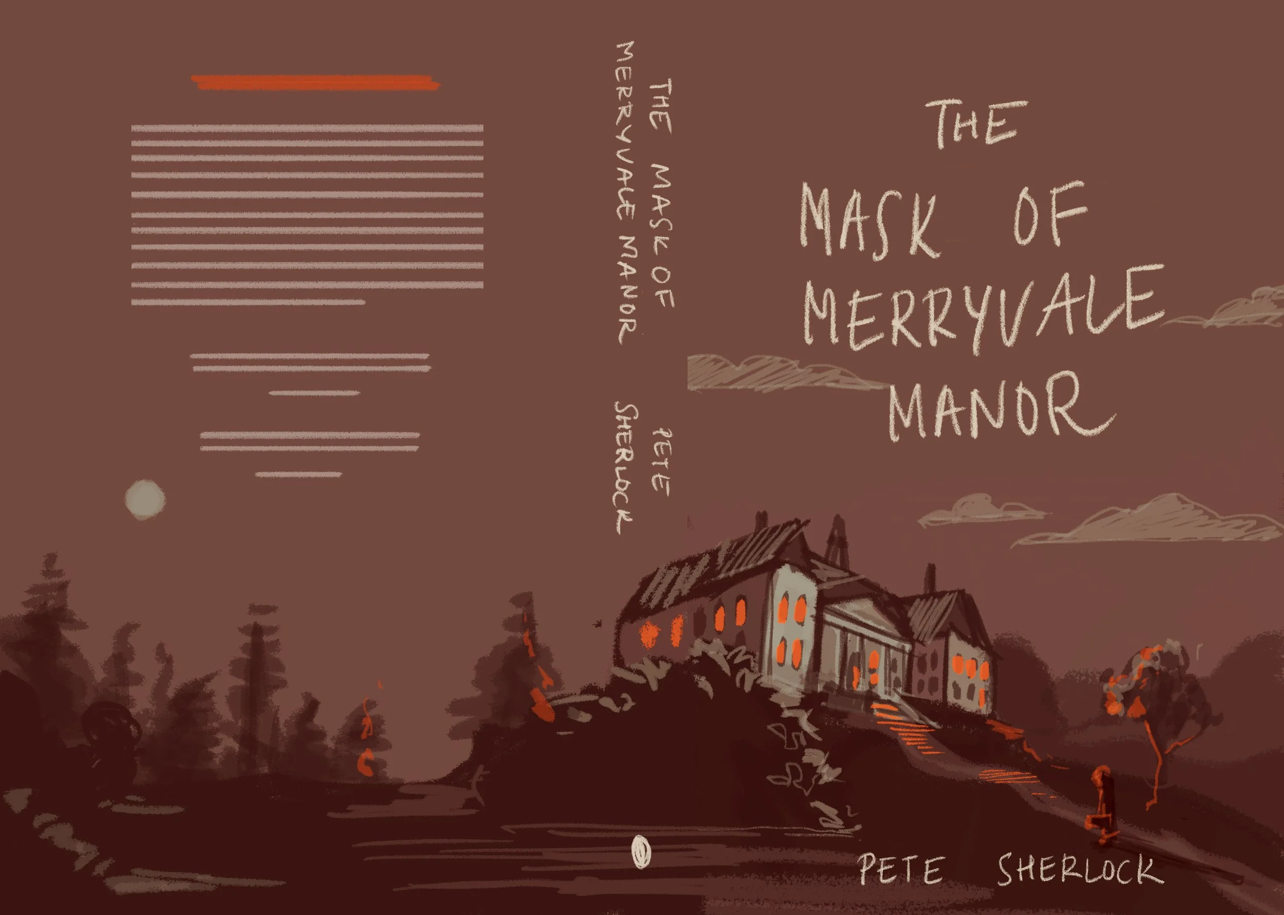
The final winning sketch combined two of my favourite sketches – the dining room scene for the front cover and the forest scene with a heeled shoe in the forefront for the back cover.
I originally settled on a fiery orange for the book title but, after a conversation with Fairlight, amended the size and colour of the title to bright white. This was done to make the title of the book ‘pop’ more and to make it stand out on the busy bookshop shelves. The font size was amended as well to make the title more legible for potential readers who could be looking books up online.
The final cover design