Heartbreak Anatomy
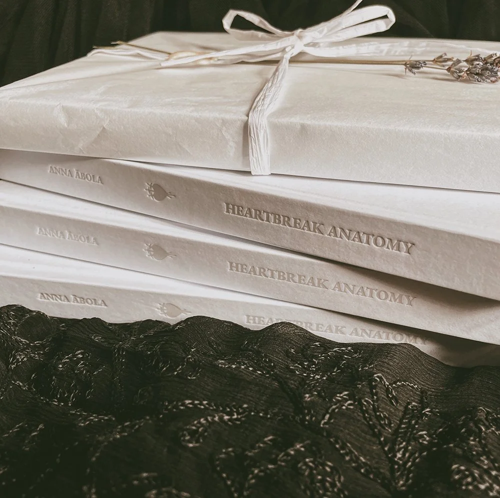
“Heartbreak Anatomy“ is the final project I created for my bachelor’s degree at the Art Academy of Latvia. It is a collection of highly personal illustrated short stories inspired by various experiences in my life that have a thread of heartbreak woven through them – from breakups and crushing on all the wrong people to struggles with body image and self-acceptance. Writing was my therapy, and I poured every last drop of blood, sweat and tears into creating this collection. The stories included in it are written between 2019 and 2022. I had been dreaming of creating this book for years, and it felt extremely rewarding to see it as a finished product. The book was printed at “Gutenbergs druka” printing house in Riga; the 1st copy (of 20) was bound and embossed by the leather artisan Ilizane Grīnberga upon my request. The process was very exciting and quite challenging, as I had never collaborated so closely with so many people before while creating an art piece. The illustrations included in this book as well as the 1st edition of it were part of the group exhibition “Lai dīgst!“ held in Riga in 2023.
the concept and idea
My goal for the layout and design of “Heartbreak Anatomy“ was to combine the aesthetic qualities of nineteenth-century novels that have inspired me both as a visual artist and as a writer with the contemporary world of digital illustration and UV print. Each element in this book was chosen with the intent of symbolically tying the stories together and connecting them into a greater message to the reader.
the endpapers
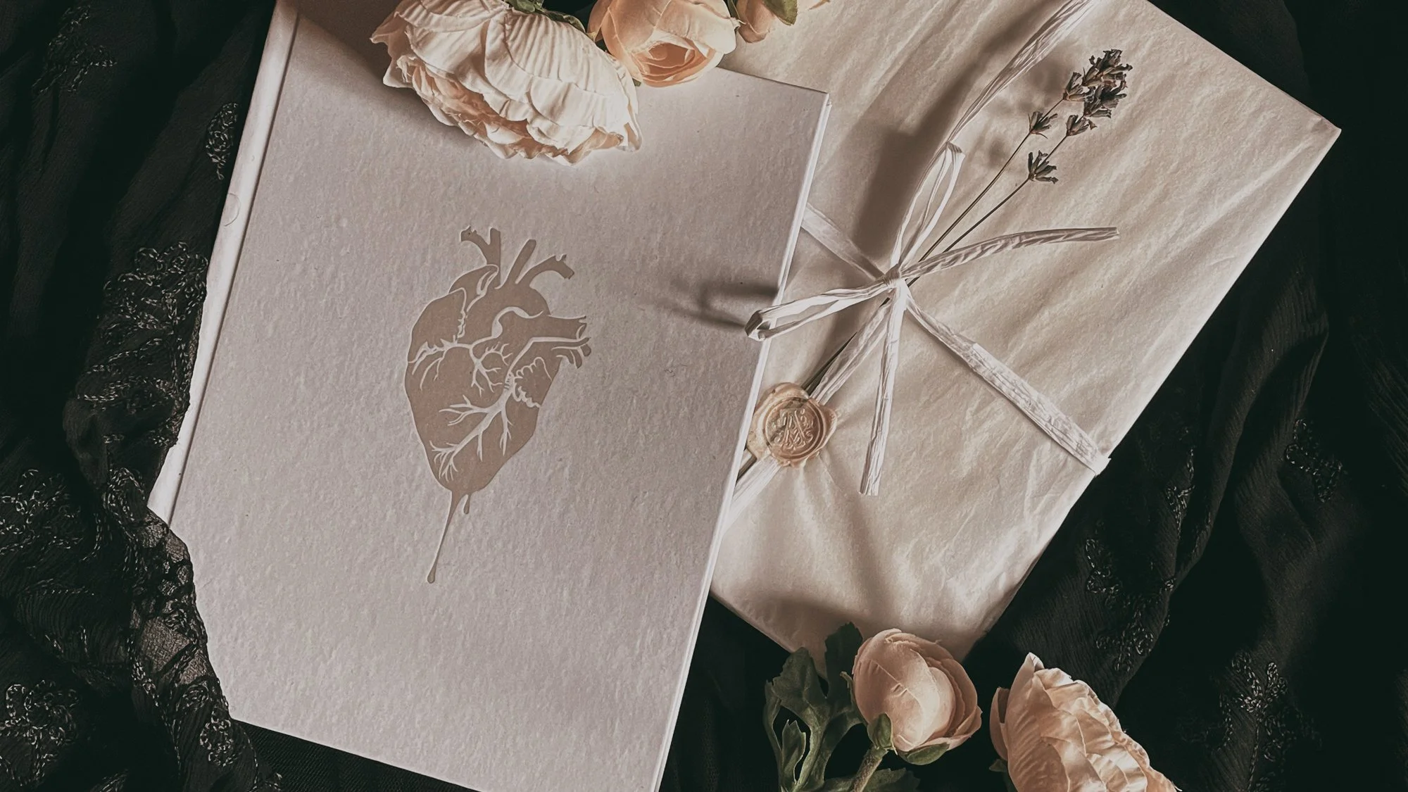
The element itself is a tiny heart pierced by three swords – a symbol found in Tarot cards. The same symbol appears on the spine of this book as well. The Three of Swords card upright symbolises heartbreak, sorrow and grief, but in reverse it means two things that were very important to me during the creation process of this book – forgiveness and releasing pain. In the endpapers this symbol appears in both ways – and so, in a way, tells a story about how I took the grief and heartbreak I had to deal with and released my pain as well as forgave and moved on by the end of this process. It was a truly healing journey.

The endpapers themselves have a pearl shine to them that can only be seen if you move them against the light. The same “you can only see it in the light” effect is present throughout this book and embodies what all of the stories are about in their core – taking what’s happening to my heroines and lifting it all out in daylight to examine with anatomical precision in order to understand it and deal with it.
glossy separating patterns
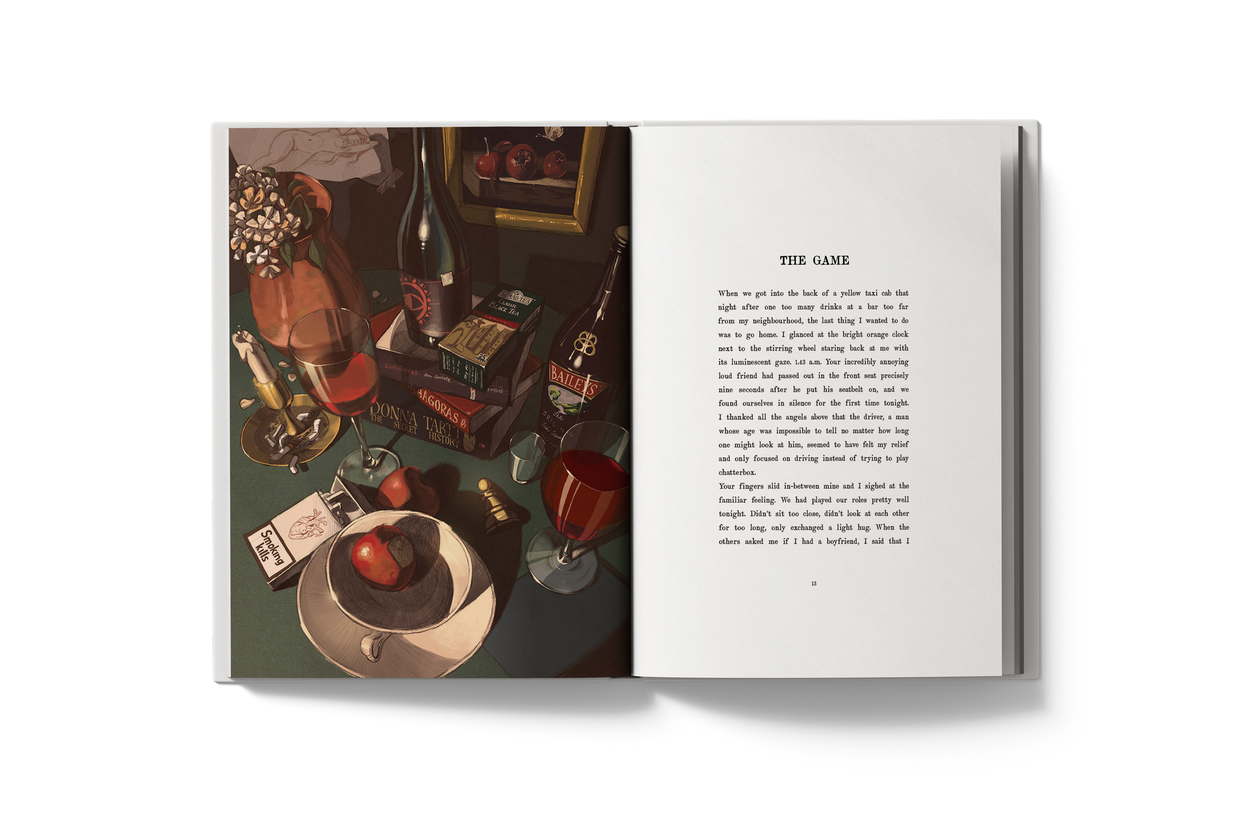
There are 9 of these patterns in the book – one for each story. I wanted to capture one important element of the illustration that would also tie in with the storyline itself. For example, the short story “The Game” has a pawn in its dividing pattern – alluding to the name of the story – the pawn in the centre of the illustration, as well as my heroine referring to her relationship with her partner as a “chess game, where we are trying to predict the moves the other would make”. So this pawn element seemed to sum up the essence of this story pretty well.
These elements are printed in clear UV print – one of the most challenging and most expensive parts of the bookmaking process for both myself and the printing house. At first they actually told me they are not sure if they can do it, as I’m the first person to ask for an effect like this. But I kept pushing and trusted them to find a way.

The reason why I was so set on making this happen was because the core idea of all my stories centres around my heroines walking in the light of the truth, picking apart their emotions and feelings, dragging them out of the shadows of uncertainty and confusion and examining them properly – “in daylight” – to understand them. So because of this concept, I wanted to create an effect that would only allow the reader to see what’s depicted if they look at the page by moving it against the light.
layout design
I knew that I wanted the look of Heartbreak Anatomy to be inspired by 1st editions of 19th-century novels. The typeface I chose is called Artful Dodger, created by Hanoded. I knew it was the one the moment I saw it; it captured the feeling I wanted to create perfectly.
One thing I was certain of for years before I even started working on the layout was that I wanted the margins of this book to be very wide. It gives the book a very luxurious feel, in my opinion, and (sadly) is a rarity in printed media today, as everyone, for obvious reasons, is trying to utilise the space they’ve got on the page to the maximum capacity.
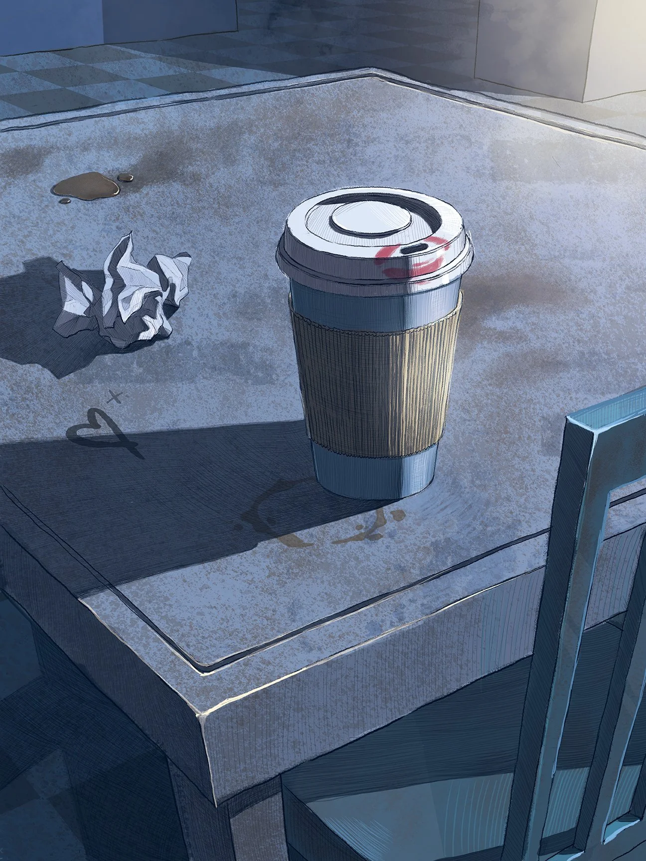
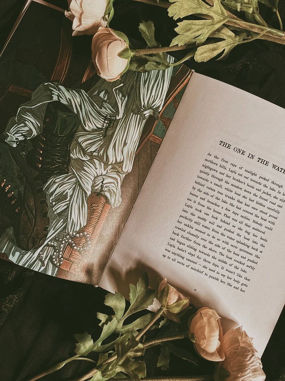
The illustration is printed on the left side of the spread, opposite the first page of each story. It’s traditionally seen in Victorian novels as well. But I also wanted the reader to see the illustration first, before they even read the words I’ve written – therefore giving them the chance to imagine what the story could be about for themselves first.

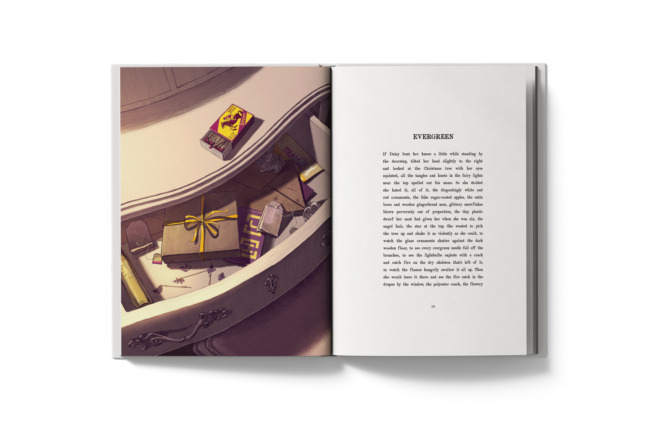
Illustration work