The Gods and Goddesses of Greece and Rome
In 2024 Thames and Hudson announced their Award for Book Design. This was my entry into their wonderful competition, where I redesigned their Greek Goddesses of Greece and Rome written by Philip Matyszak.


the brief
The purpose of this competition was to breathe new life into much-loved existing Thames and Hudson publications. As part of Thames & Hudson’s 75th birthday celebrations in 2024, they invited students of design or illustration to complete a book design brief in one of four categories: Art, History, Photography and Children’s Books.

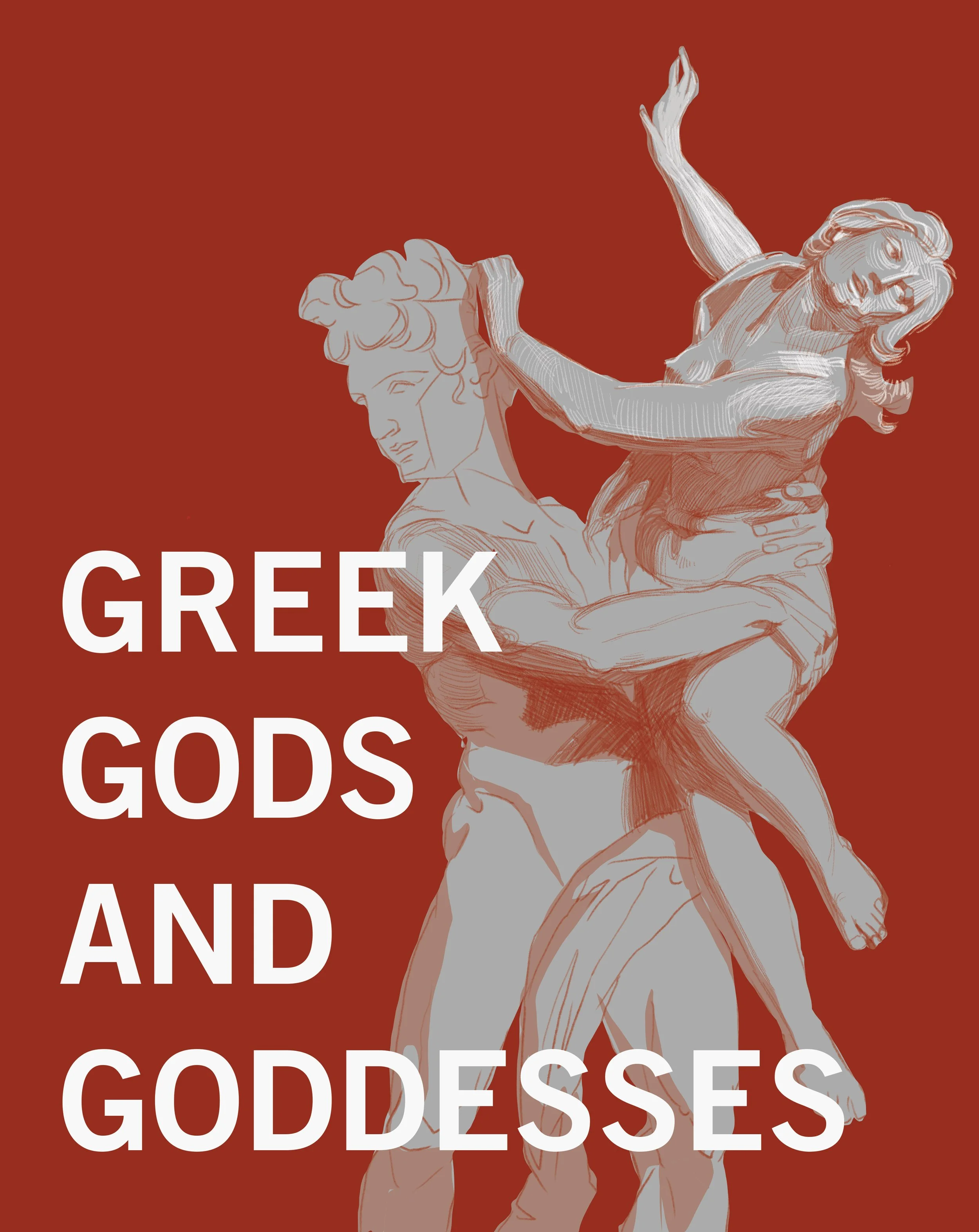
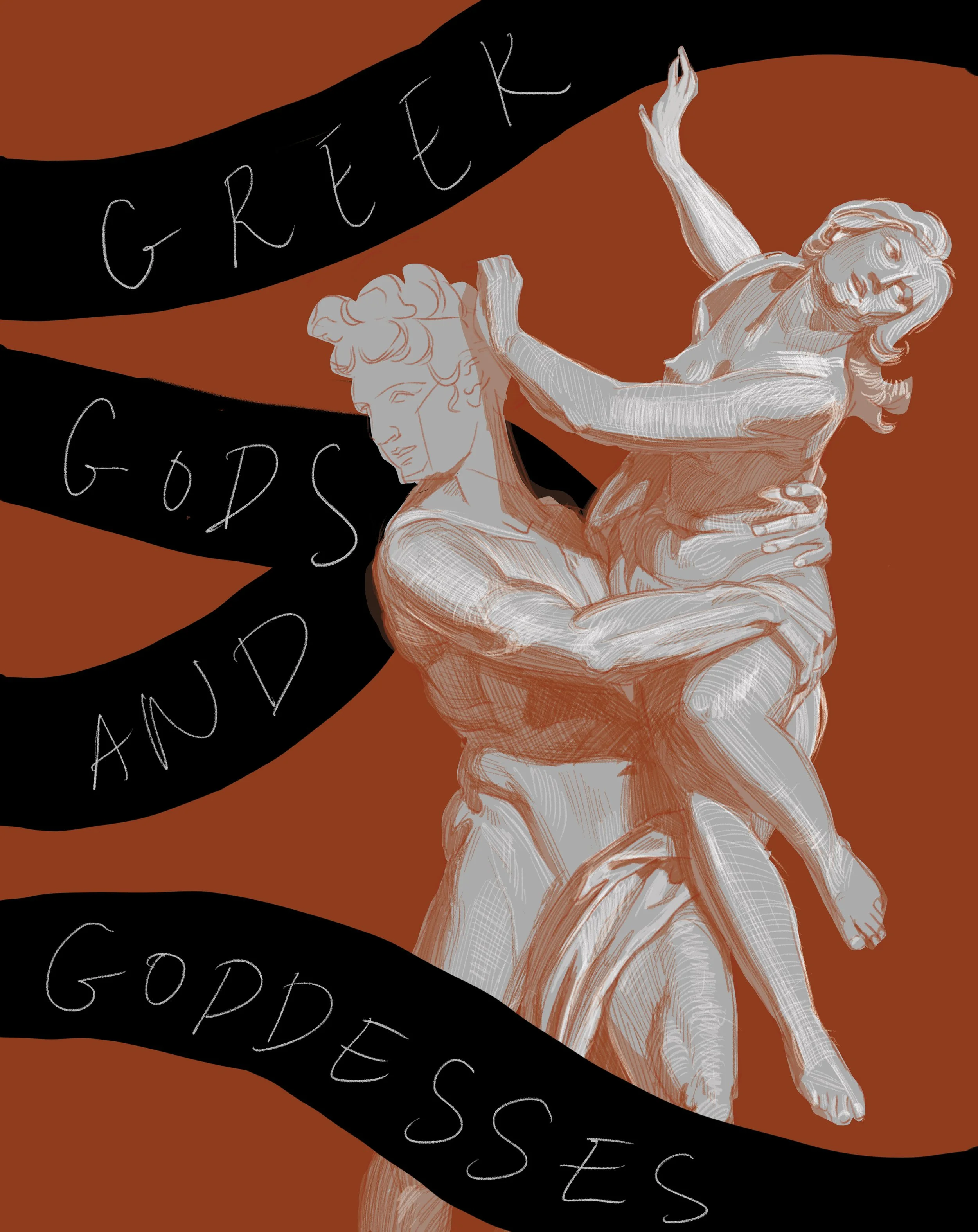
The Abduction of Proserpina by Gian Lorenzo Bernini
the process
I began my work by revisiting one of my favourite Greek myths about Hades and Persephone. This sent me down a research rabbit hole of Ancient Greek imagery and symbolism. Soon enough I stumbled across a wonderful sculpture – The Abduction of by an Italian sculptor, Gian Lorenzo Bernini.
The current cover of this publication is beautiful, but in my opinion, it is lacking the dramatic expression, emotion and movement that ancient myths are so full of. This sculpture had all of these qualities, and so it became the main source of inspiration for my cover illustration.
the front cover
The first sketch
I was happy with how the illustration was coming along, but the text felt too monotone and disconnected from the artwork.
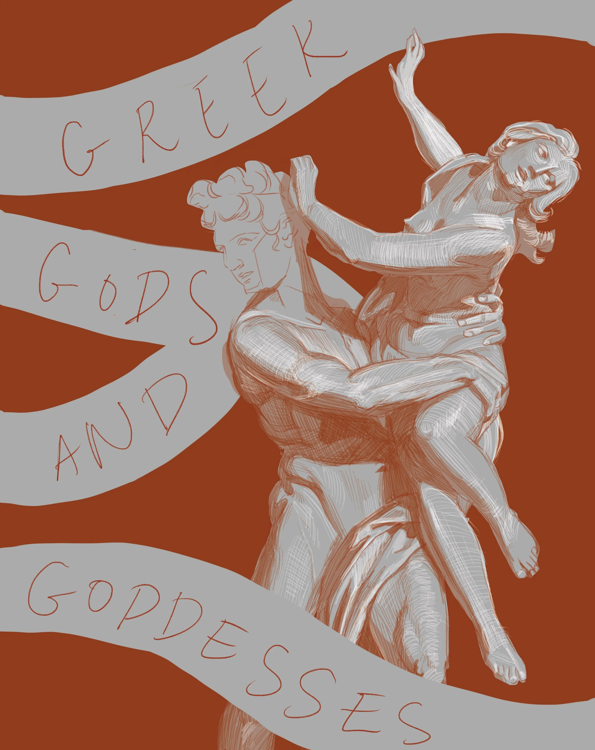
the second sketch
I tried to integrate the text into the cover more seamlessly by placing it onto ribbon-like elements. These elements were inspired by the myth of the Three Fates, who were in charge of deciding the fate of all beings by cutting threads of life.
the third sketch
The ribbons were lacking contrast, so I changed the colour to black to make them stand out more and to separate them from the marble-white of the sculpture.

The fourth sketch
I worked on refining the thread-like elements and the typeface. I created a fraying effect around the edges of the black ribbons to convey the fragile nature of the lives of mortal beings in Greek myths. The statue of the gods stood in solid marble as a contrast to this.
The fifth sketch
I was happy with the composition now, but the orange and black colourway felt too predictable. I experimented with a few other colours along the way.

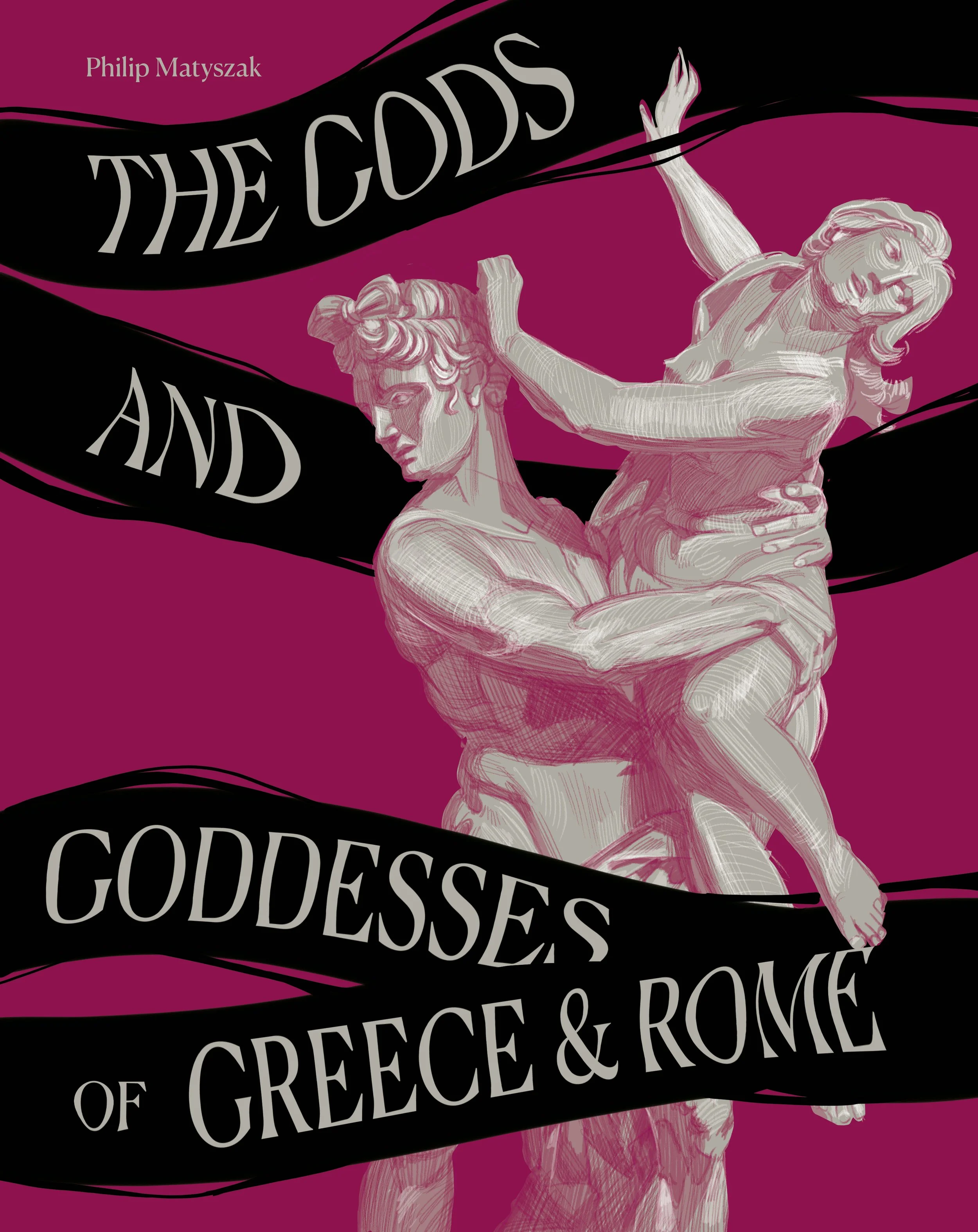
The final cover
I settled on a teal and burnt orange colourway.
the layout
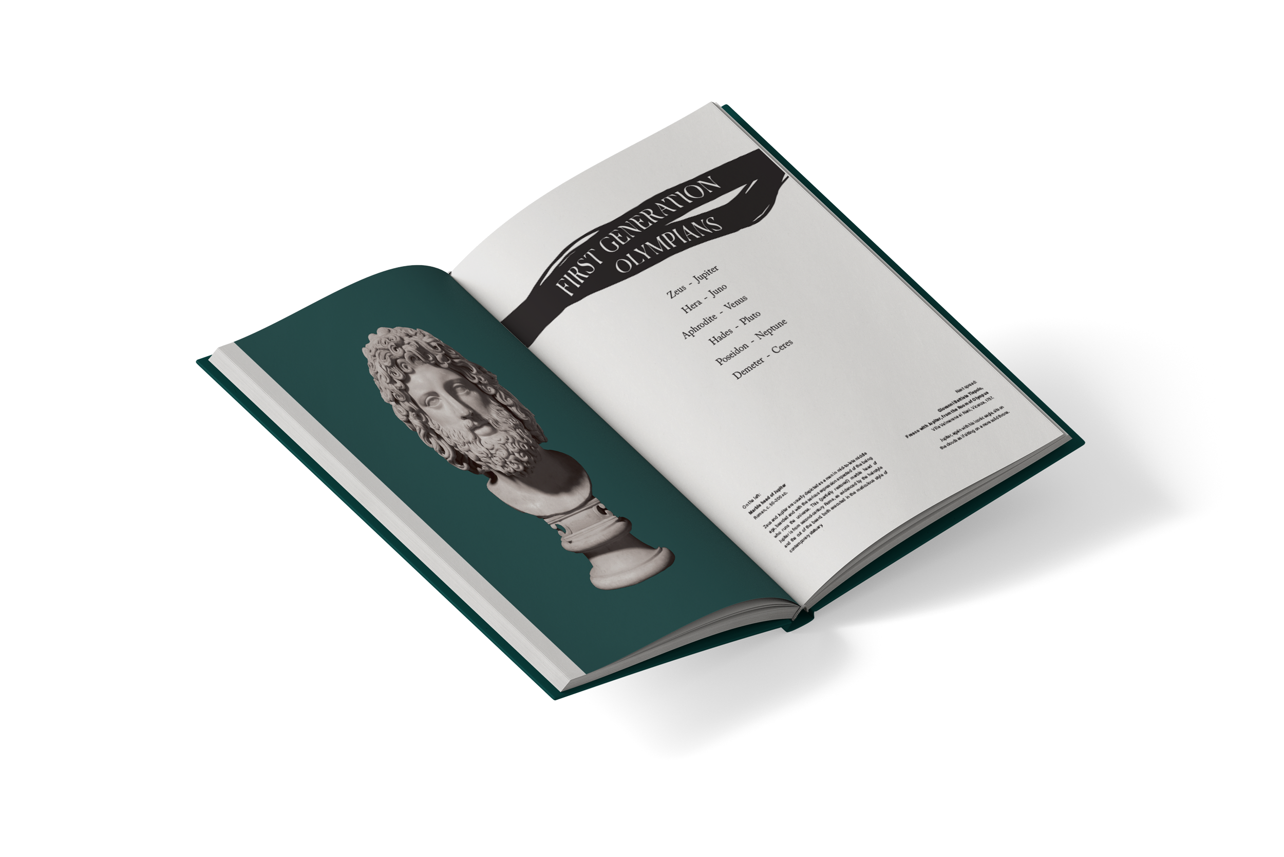
For the endpapers, I depicted the names of gods and goddesses on the same ribbon-like elements I included on the cover. The names of Greek gods are placed on the front endpapers, and their respective Roman counterparts - on the back. These ribbons appear throughout the layout design, marking chapter titles as well and tying the design together. The teal colour of the cover is present throughout the book as well.
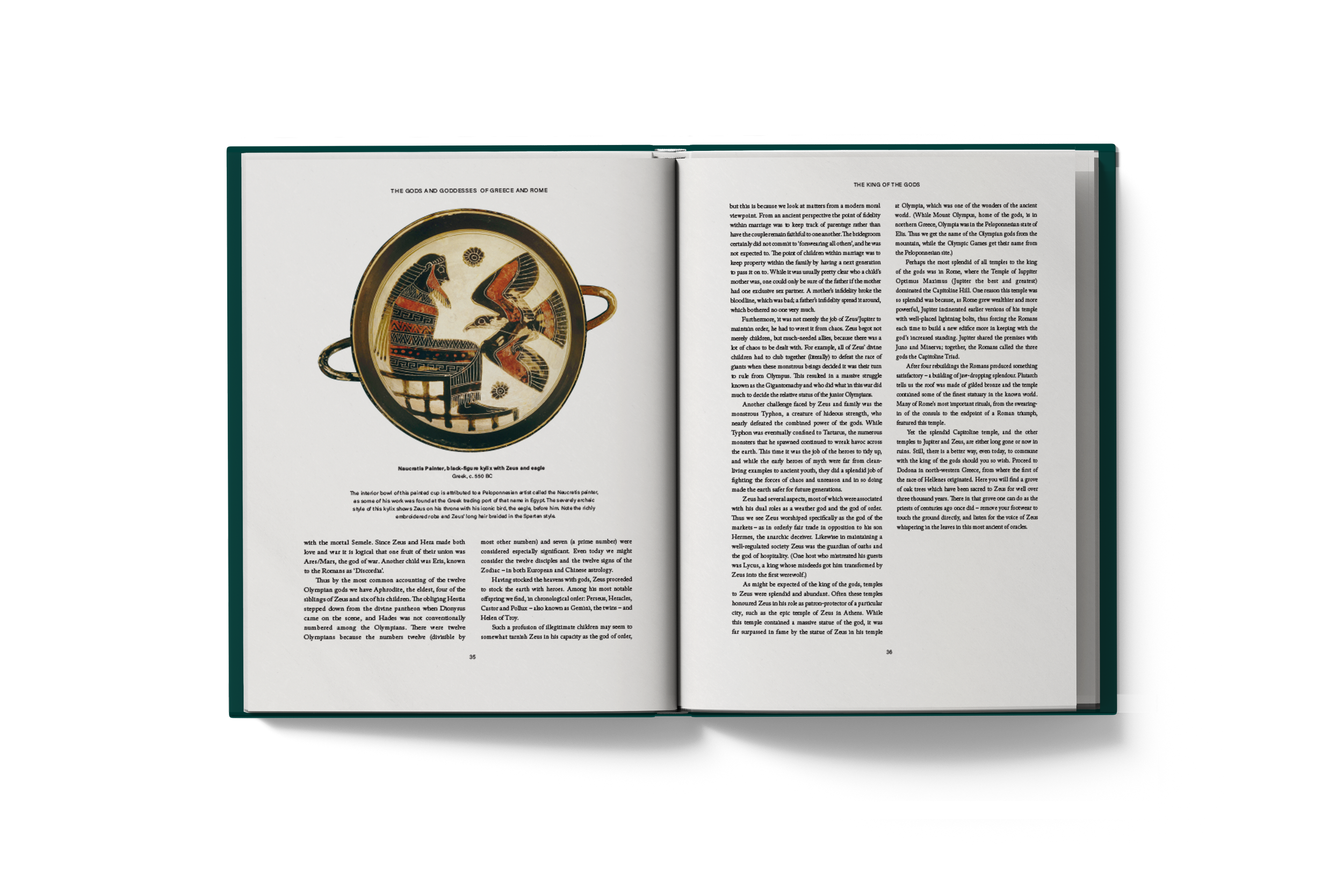
I kept the layout design for the book itself simple and classic - with 2 columns of justified serif text for easier reading. I also included full colour images that Thames & Hudson provided in the brief and their respective descriptions.