Fenda rebrand project
Fenda Shadow Profiles is a firm that produces a specific type of interior design element: shadow gap profiles. A shadow gap profile is an architectural and interior design element where a small, deliberate gap is created between two surfaces, typically a wall and a ceiling or floor, resulting in a subtle shadow line that adds a modern, minimalist aesthetic. This gap, often referred to as a shadow line, creates a visual separation and depth, enhancing the overall design of the space. These profiles are usually used to add a feeling of lightness in interiors, as they can make surfaces appear like they are “floating” above ground.
the brief
Here you can see the logo that Fenda has had since the brand was founded. Their representatives wanted to refresh the style of the logo, but wanted to keep the overall composition of it intact, still preserving the big letter F over the name of the firm, to avoid looking too foreign to their long-time clients

the concept
Where does the old logo fail?
Besides breaking the big “no-no” of logo design and including a feather faded gradient in its logo mark, most importantly, Fenda’s old logo does not showcase the type of shadow that the company’s shadow gap profiles create. The shadows these gap profiles drop look more like straight, crisp lines than feathered-out long shadows. I wanted the logo to reflect what the company offers more accurately in my new design.

the process
Keeping the company’s request in mind, I sketched out a few ideas for the new logo while retaining the original composition. I upgraded the letter F in the logo to be reminiscent of shadow gap profiles, which worked out great with the shape of the letter itself.
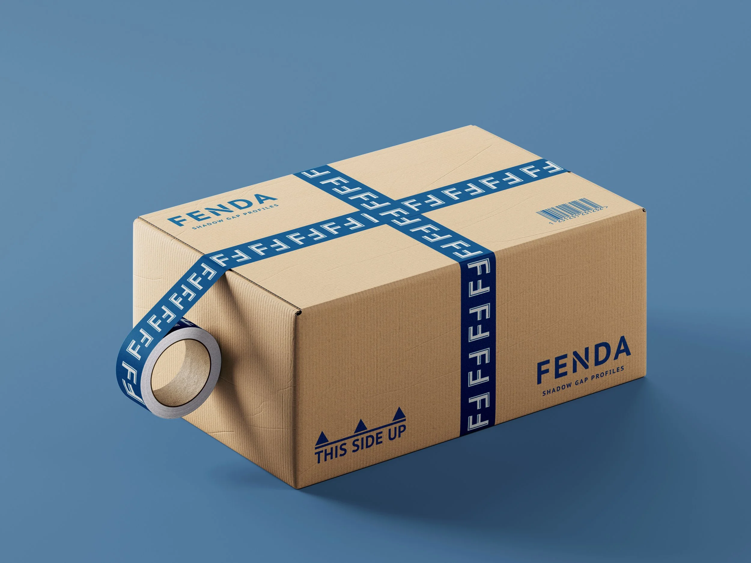
the execution
I settled on a minimalistic style and crisp, clean, angular lines for the new logo mark. For the brand colours, I chose a calm, blue hue, reminiscent of the colour of shadows in the summer, as well as a warm cream colour that elevates the overall look and evokes sophistication – the way that Fenda’s gap profiles do.
For the brand’s font I chose the simple PT SANS Caption Bold, and a modified version of this font was worked into the logo as well. I created a brand pattern with two connected logo marks, a humorous nod of appreciation towards the luxury brand Fendi.